GSoC 2020: implementing real-time metrics for MGGG's Districtr app
Fri Aug 28 2020tags: programming build public project mggg gsoc internship
Introduction
For Google Summer of Code 2020, I implemented a new feature to MGGG's flagship webapp Districtr. Districtr has an existing feature where you can "colour in" districts using a brush tool: each colour represents a different district.
My contribution can be seen in the bottom right corner of the below GIF. As you draw the districts with the brush, three metrics update in real time:
- the contiguity status (whether districts drawn are one continuous whole or get broken up in the middle);
- The number of cut edges;
- How the number of cut edges compares to a sample of plans generated by the Recom redistricting algorithm
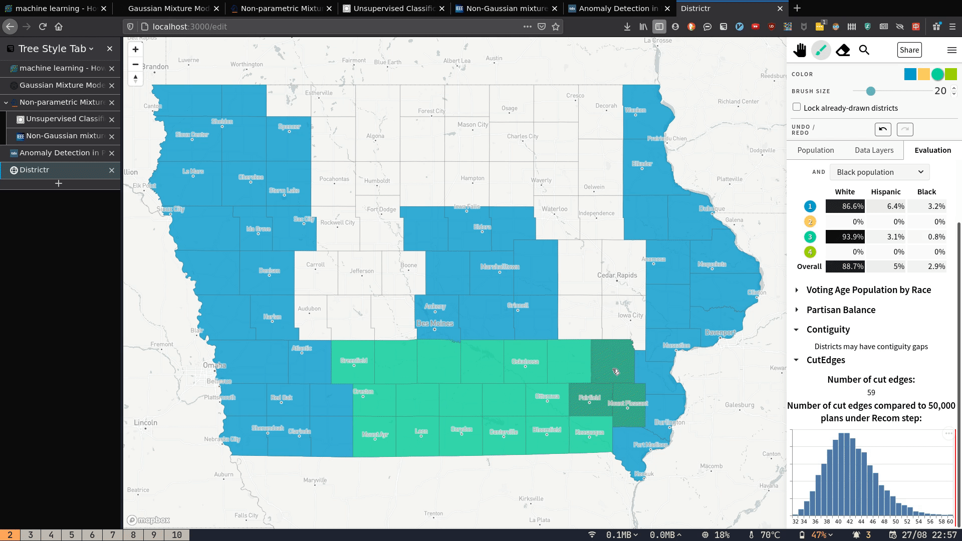
Because I know of no way to find contiguity/number of cut edges of a graph partition in-browser, this thus requires server-side computation. In this post, I explain how these metrics are calculated, how I deployed the server that does the calculations, and how I built the front-end to send requests and display the results.
The main PR is #212 where I implement cut edges here (PR #212) but I also implemented contiguity before that here (PR #209)
Understanding the problem
A state can be thought of as a dual graph, and a particular district assignment of precincts to districts is in effect creating a partition of that dual graph. Given this partition of the dual graph we can then calculate out whether or not the subgraphs are contiguous and how many cut edges there are in the partition.
How should we calculate this? I determined that the best way to do so was to use the GerryChain library (written in Python). The biggest reason is dogfooding: since GerryChain is being actively developed by the MGGG group, it made sense to use GerryChain rather than some other library.
Software infrastructure in brief
This is a very simple client-server model.
The Districtr webapp is built on lit-HTML. The histogram is dynamically drawn with Vega.
The server is a Flask server that calls GerryChain code.
The solution in brief
- Upon a brush stroke, the client sends a POST request to the Flask server (hosted on PythonAnywhere).
- The server calculates the metrics and sends them as a response to the client.
- The client takes the response and rerenders the DOM appropriately.
Step 1: The client sends the district assignment to the server
Drawing districts with the brush in the Districtr website updates an
assignment object. This object looks something like this (but see Appendix):
{
    19001: 2,
    19002: 0,
    19003: 1,
    19004: 1,
    19005: 1,
    ...
}
The key is the voting precinct ID and the value is the district it has been assigned to. For instance, precinct 19001 has been assigned to district 2.
This assignment object is sent to the Python server for computation.
Step 2: The server calculates metrics and responds to the client
The server receives the assignment object,
and converts it to a GerryChain Partition object provided it has that state's dual graph:
partition = gerrychain.Partition(state_graph, assignment, None)Using the Partition object we calculate cut edges and contiguity metrics,
then send them to the client.
Step 3: the client updates its UI with the server's response
The client updates its UI appropriately with the server's response. The histograms are rendered with Vega (more on this later).
At a high level, that's all there is to it! I'll now explain the solution in detail.
The solution in detail
Step 1: The client sends the district assignment to the server
The assignment object is not just sent once, but constantly as the user draws
districts on the Districtr app.
In the ToolsEditor() function in /plugins/tools_plugin_js there is a brush.on
event that detects any change in district assignment, and sends the
new assignment to a ContiguityChecker function. The spatial_abilities() condition
checks if contiguity checks have been enabled for that particular state.
(TODO: this function enables/disables contiguity and cut edges all at once. We should find some way to fix this, or at least rename it. )
const c_checker = ContiguityChecker(state, brush);

brush.on("colorop", (isUndoRedo, colorsAffected) => {
  savePlanToStorage(state.serialize());
  if (spatial_abilities(state.place.id).contiguity) {
    c_checker(state, colorsAffected);
  }

  if (planNumbers) {
    planNumbers.update(state, colorsAffected);
  }
});
The ContiguityChecker function lives in src/map/contiguity.js,
where it sends the district assignment to the PythonAnywhere server through
a POST request:
export default function ContiguityChecker(state) {
  let saveplan = state.serialize();
  console.log(saveplan);
  const GERRYCHAIN_URL = "//mggg.pythonanywhere.com";

  fetch(GERRYCHAIN_URL, {
    method: "POST",
    headers: {
      "Content-Type": "application/json",
    },
    body: JSON.stringify(saveplan),
  });
  ... // code removed for brevity ...
}
Step 2: The server calculates metrics and responds to the client
The Python server is as simple as can be. It is a Flask server with only one route:
@app.route('/', methods=['POST'])
# Takes a Districtr JSON and returns whether or not it's contiguous and number of cut edges.
def plan_metrics():
    plan = request.get_json()
    ... # code removed for brevity
    districtr_assignment = plan["assignment"]
    ... # code removed for brevity
As we can see, the server just parses the POST request
and then pulls out the Districtr assignment object.
Now what do we do with it?
The first step is to convert the Districtr assignment object we've received to a format that GerryChain can work with. There's already a function that does something similar, but it i) loads from a file instead of an object, and ii) doesn't handle incomplete assignments (i.e. when the user doesn't fill up the map completely). I therefore wrote my own code that could handle both of those things.
(TODO: make a PR to GerryChain to add new classmethod)
How we handle incomplete assignments is somewhat arbitrary, but I decided to
put all non-assigned nodes into a district of their own (district -1).
After the assignment is complete, we then use the gerrychain.Partition function
to create a partition and calculate cut edges and contiguity.
partition = gerrychain.Partition(state_graph, assignment, None)

# Now that we have the partition, calculate all the different metrics

# Calculate cut edges
cut_edges = (partition['cut_edges'])

# Split districts
# TODO timeit this --- how long does it take?
split_districts = []
for part in gerrychain.constraints.contiguity.affected_parts(partition):
    if part != -1:
        part_contiguous = nx.is_connected(partition.subgraphs[part])
        if not part_contiguous:
            split_districts.append(part)

# Contiguity
contiguity = (len(split_districts) == 0)
We send the calculated metrics back to the client:
response = flask.jsonify({'cut_edges': len(cut_edges), 'contiguity': contiguity, 'split': split_districts})Step 3: the client updates its UI with the server's response
The fetch request the client sends has hopefully returned with no error. If so, we start updating the UI and do three things:
- set contiguity status,
- set number of cut edges,
- draw a histogram of cut edges and show where the current plan lies.
    fetch(GERRYCHAIN_URL, {
      method: "POST",
      headers: {
        "Content-Type": "application/json",
      },
      body: JSON.stringify(saveplan),
    })
      .then((res) => res.json())
      .catch((e) => console.error(e))
      .then((data) => {
        console.log(data);

        // Set contiguity status
        setContiguityStatus(data);

        // Set number of cut edges
        let num_cut_edges = setNumCutEdges(data, state_name);

        // Embed the canvas
        const state_name = saveplan['placeId'];
        const container = document.querySelector(".cut_edges_distribution_vega");
        const vega_json = __form_vega_json__(state_name)
        vegaEmbed(container, vega_json).then((v) => {

          // Wait for vegaEmbed to generate the canvas, then draw a line on it
          const canvas = document.querySelector(".marks");
          const left_bound = state_info[state_name]["lr_bounds"][0];
          const right_bound = state_info[state_name]["lr_bounds"][1];

          __draw_line_on_canvas__(canvas, num_cut_edges, left_bound, right_bound)
        })
The setContiguityStatus and setNumCutEdges are pretty straightforward
functions where I just change the innerText of the relevant HTML elements.
If we were doing this in React it would probably be better to store
contiguityStatus and numCutEdges as state and have some sort of hook to
update, but this approach works fine:
function setContiguityStatus(contiguity_object) {
  let contiguous = contiguity_object.contiguity;
  document.querySelector("#contiguity-status").innerText = !contiguous
    ? "Districts may have contiguity gaps"
    : "Any districts are contiguous";
}
The most complicated function is rendering the histogram of districting plans and drawing the red line on the histogram, and I'll go through that now.
Generating the distribution of cut edges
First of all, what is the histogram representing? Where does it come from? The histogram shows the number of cut edges from 10,000 sample districting plans. These plans were generated using the Recom redistricting algorithm, a districting algorithm developed by MGGG. The maths is complicated, but essentially it's a Markov Chain technique; it starts from some random assignment, and to generate a new assignment it changes the assignment of certain districts in a "smart" way so as to maintain contiguity, population balance and relative compactness. Each one of these generated plans has a number of cut edges. After running the algorithm for 10,000 steps, we'll have gotten a distribution of the number of cut edges, and this is exactly what we are plotting.
 How districting plans are generated by the Recom algorithm. Image from the Recom paper
For each state we have precomputed 10,000 sample districting plans
and stored it in a csv file.
This process takes anywhere from a few hours to a few days, but only has to be done once:
once the distribution of cut edges is known it can simply be used again and again.
The csv files live in
assets/cut_edges_histograms/$STATE_chain_10000/csv.
Generating the histogram
The next step is drawing the histogram on the UI. I initially used a PNG generated by
matplotlib.hist, but this turned out to be nonideal because the UI could resize
and PNGs are not responsive. We therefore need to generate histograms dynamically.
and after some searching I decided on Vega-Lite.
Vega-Lite is a "high-level grammar of interactive graphics" that "provides a concise, declarative JSON syntax to create an expressive range of visualizations for data analysis and presentation". To create the histogram I needed to write a JSON object that specified what data to plot and how I wanted it to be plotted:
// Returns the Vega Lite schema needed for rendering the state cut edge histogram dynamically
function __form_vega_json__(state_name) {
  const vega_json = {
    $schema: "https://vega.github.io/schema/vega-lite/v4.json",
    data: { url: state_info[state_name]["state_csv"] },
    mark: "bar",
    width: "container",
    autosize: {
      type: "fit",
      contains: "padding",
    },
    encoding: {
      x: {
        bin: { maxbins: 40 },
        field: "cut_edges",
      },
      y: { aggregate: "count" },
    },
    config: {
      axisY: {
        labels: false,
        title: null,
      },
      axisX: {
        title: null,
      },
    },
  };

  return vega_json;
}
Then we use a helper function vegaEmbed
to embed the visualisation into the DOM.
VegaEmbed takes a container element and the vega_json schema
and generates a HTMLCanvasElement with <canvas class='marks'> within the container
element:
    vegaEmbed(container, vega_json).then((v) => {
        // here v is the vega view, but we will ignore it
        const canvas = document.querySelector(".marks");
        const left_bound = state_info[state_name]["lr_bounds"][0];
        const right_bound = state_info[state_name]["lr_bounds"][1];
        __draw_line_on_canvas__(canvas, num_cut_edges, left_bound, right_bound)
    }
I take that canvas element and pass it to my __draw_line_on_canvas__ function,
which draws a line that represents how the current districting plan
compares to the sample of plans.
You may be wondering:
What is the state_info object? It is basically a map that tells the code
where to find the data CSV object, and the upper and lower bounds of the number
of cut edges in the 10,000 generated plans.
We need the upper and lower bounds in __draw_line_on_canvas__ to
draw the line, as you'll see later.
const state_info = {
  connecticut: {
    state_csv: "../assets/cut_edges_histograms/CT_chain_10000.csv",
    lr_bounds: [110, 270],
  },
  iowa: {
    state_csv: "../assets/cut_edges_histograms/IA_chain_10000.csv",
    lr_bounds: [32, 60],
  },
  texas: {
    state_csv: "../assets/cut_edges_histograms/TX_chain_10000.csv",
    lr_bounds: [2720, 3440],
  },
};
Drawing the red line on the histogram
The red line in the image below shows how the current plan compares to a set of generated plans in terms of number of cut edges. The main difficulty is that we have a number of cut edges---but to draw the line, we need to convert that to an x-position on the histogram.
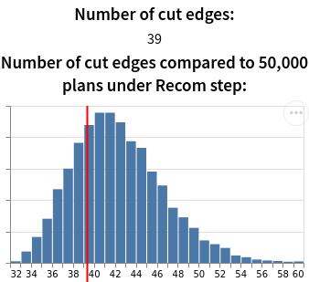
To do that, we need the upper and lower bounds of the cut edges distribution:
- If the number of cut edges is below the lower bound, we set line position to 0.
- If it is above the upper bound, we set it to the canvas width.
- And if it lies somewhere in between, then since the x-axis is uniform,
the x-position given a number of cut edges
nis
In this example, suppose the canvas is 300px wide, and the lower bound and upper bound are 32 and 60 cut edges respectively. Then 39 cut edges would correspond to
We then get the canvas's Canvas2DContext
and draw a line at the correct x-position, which in this case is 75px.
The code looks like this:
function __draw_line_on_canvas__(
  canvas,
  num_cut_edges,
  left_bound,
  right_bound
) {
  const w = canvas.width;
  const h = canvas.height;
  let line_position = 0; // this is going to be a value between 0 and w

  if (num_cut_edges <= left_bound) {
    line_position = 0;
  } else if (num_cut_edges >= right_bound) {
    line_position = w;
  } else {
    line_position =
      ((num_cut_edges - left_bound) / (right_bound - left_bound)) * w;
  }

  console.log("Line position: ", line_position);

  console.log("Line position:", line_position);
  const ctx = canvas.getContext("2d");
  ctx.lineWidth = 2;
  ctx.strokeStyle = "red";
  ctx.beginPath();
  ctx.moveTo(line_position, 0);
  ctx.lineTo(line_position, h);
  ctx.closePath();
  ctx.stroke();
}
And that's it!
What I learned
How to work with a complex existing codebase
In my previous projects I have always started writing code from scratch, and
that's much easier because code complexity is lower,
you know where everything is,
you understand every single part of what you're building,
there are no complicated build pipelines,
and you can always just push to origin/master.
This was significantly harder because there was already an existing medium-sized codebase (~10,000 LOC) running tech stacks/folder structure/build pipelines unfamiliar to me.
lieu@pop-os ~/d/districtr (lieu-branch)> cloc src/ sass/ html/
     158 text files.
     158 unique files.
       0 files ignored.

github.com/AlDanial/cloc v 1.82  T=0.05 s (3398.9 files/s, 317945.9 lines/s)
-------------------------------------------------------------------------------
Language                     files          blank        comment           code
-------------------------------------------------------------------------------
JavaScript                     110            703            543           9030
Sass                            35            424             53           2429
HTML                            13             44             83           1471
-------------------------------------------------------------------------------
SUM:                           158           1171            679          12930
-------------------------------------------------------------------------------
I found it very difficult to get the "big picture": where's the entry point of the entire app? What files call what? How and where should I add my code? How does the build process work? This is much more difficult than implementing some disembodied function somewhere because in order to add the new component I had to get a working understanding of the entire codebase. It took a long time, but it was rewarding to puzzle through it, and---while I won't claim to know the codebase well---I now know enough to implement future features much more quickly.
Another thing I had to learn was how to use version control properly: forking the main codebase, using branches, and making PRs back into main. It also forced me to be more atomic with my commits as I previously had the very bad habit of coding for hours if not days without a single commit, changing tons of files, then running the following:
git add .
git commit -m "add lots of stuff"
git push
which is not good practice, so I'm glad that I kicked the habit.
Future work
Improve performance of the server
The current server is able to quickly calculate and respond in fractions of a second for a state like Iowa (0.007s, according to my server logs), but the delay between sending and receiving a response can be up to 1.5s for the largest states like Texas. This delay is barely acceptable for a single user but completely unacceptable when we deploy it into production e.g. with multiple concurrent users. At the current scale of Districtr, it should be more than sufficient to handle up to 100 requests/second. It could do 100 Iowa requests/second but not 100 Texas requests/second, so there's some work to be done.
I will have to do some benchmarking: why is the server slow? Is it converting the JSON to a dual graph, generating the partition, or sending the response back that's slow? Depending on the answer, we could either consider horizontal scaling (implementing a load balancer) or moving to the very recently developed JuliaChain (GerryChain in Julia). (Maybe also Amazon lambda functions.)
([TODO] do benchmarking and ask Bhushan/Matthew about benchmarking in Julia)
EDIT 28/08: I did the benchmarking and it turns out that loading the JSON file in was indeed what was taking so long:
2020-08-28 10:18:54 /home/mggg/districtr-eda/dual_graphs/mggg-dual-graphs/texas.json
2020-08-28 10:18:54 Time taken to load into gerrychain Graph from json: 0.8254358768463135
2020-08-28 10:18:54 Time taken to form assignment from dual graph: 0.008115530014038086
2020-08-28 10:18:54 Time taken to form partition from assignment: 0.0035495758056640625
2020-08-28 10:18:55 Time taken to get split districts: 0.0813145637512207
Caching the state graph (just adding it to a dictionary and checking if it exists) makes it much, much quicker. Total response times dropped from 0.85 seconds to ~0.1 seconds.
2020-08-28 10:38:51 /home/mggg/districtr-eda/dual_graphs/mggg-dual-graphs/texas.json
2020-08-28 10:38:51 Caching the state graph...
2020-08-28 10:38:51 Time taken to load into gerrychain Graph from json: 0.7195932865142822
2020-08-28 10:38:51 Time taken to form assignment from dual graph: 0.0022351741790771484
2020-08-28 10:38:51 Time taken to form partition from assignment: 0.002564668655395508
2020-08-28 10:38:52 Time taken to get split districts: 0.013953685760498047
2020-08-28 10:38:53 /home/mggg/districtr-eda/dual_graphs/mggg-dual-graphs/texas.json

2020-08-28 10:38:53 Retrieving the state graph from memory..
2020-08-28 10:38:53 Time taken to retrieve the state graph from memory: 4.5299530029296875e-06
2020-08-28 10:38:53 Time taken to form assignment from dual graph: 0.002898693084716797
2020-08-28 10:38:53 Time taken to form partition from assignment: 0.003316164016723633
2020-08-28 10:38:53 Time taken to get split districts: 0.014100790023803711
Conclusion
I really enjoyed my time with MGGG and I learned a lot from implementing a feature onto an existing codebase. I didn't learn much on the technical level, but I did learn a lot about working as an actual software engineer in a team contributing to an established product, rather than as a seat-of-the-pants hackathon lone-wolf developer. This was my explicit goal when applying to MGGG, so I am happy with the outcome.
Appendix
I have collected dual graphs into an open-source repo.
As mentioned in the text, the server cannot generate a Partition without
the dual graphs. I've thus collected dual graphs from Gabe and Nick and put them
into a repo here. I would welcome
any and all to add to the repo to roll this out to more states.
([TODO] --- where is Districtr getting the dual graphs for all the states then??)
How to set up the server on PythonAnywhere
I have written instructions on how to deploy the Flask server on PythonAnywhere on the README.md in the GitHub repo
([TODO] deploy Flask production server)
How the assignment object actually looks like
I told a little white lie for ease of exposition. The assignment object actually looks like this:
{
    19001: [2],
    19002: [0],
    19003: [1],
    19004: 2,
    19005: [1],
    ...
}
Each key-value pair takes the form of either an Int: Array[Int] or Int: Int,
where the key is the voting precinct ID and the value is the district it has been assigned to.
(For some reason, some values will appear as arrays
even though each precinct can only be assigned to one district).